
Let’s assume a customer visiting your store to buy a blue T-shirt. She scrolls down to the color option and sees a plain dropdown box that says “Choose an option.”
She clicks it, and a list of names shows up, like Navy, Charcoal, Ocean Blue, and Slate. There are no pictures and no visual clues at all. She cannot tell Ocean Blue apart from Navy without clicking each one and waiting for the product image to change.
That is an extra click and a few seconds of wasted time. Now, multiply that across every product in your store and every visitor who lands on them. It becomes clear why a simple dropdown menu can quietly hurt your sales.
This is the exact problem that WooCommerce color swatches solve. In this guide, we will cover what they are, why they matter, the different types you can use, where to place them, and how to add them the right way. We won’t turn this into a sales pitch. By the end, you will know exactly what to look for when picking a plugin for your store.
What Are WooCommerce Color Swatches?
WooCommerce color swatches replace the plain dropdown box that WooCommerce shows by default. Instead of making shoppers open a box and read through text, swatches show colors and other choices as small, clickable shapes right on the page.
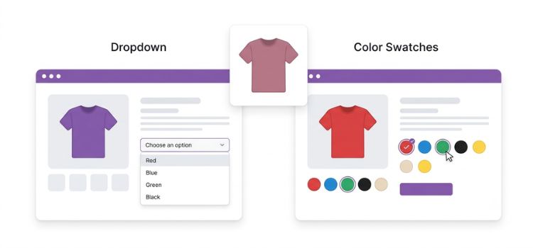
Think of small colored circles or squares under a product photo. Each one shows a real option, like red, black, green, or sand. The shopper can see every color at once and pick one with a single click. No dropdown box. No guessing. No extra steps.
This is used for WooCommerce variable products. A variable product is a product that comes in different versions, like different colors, sizes, or materials, but is shown as one product on your store.
Swatches take these options and turn them into something the shopper can see, instead of plain text hidden inside a dropdown.
Many big online stores already do this, and it makes sense why. It copies the way people shop in a real store, where you see the colors before you choose. WooCommerce does not do this on its own. That is why swatches have become a normal part of most serious WooCommerce stores, not just a nice extra.
Why Plain Dropdowns Hurt the Shopping Experience
WooCommerce’s built-in dropdowns work fine on paper. But working is not the same as working well, and there are a few clear reasons why plain dropdowns push customers away.
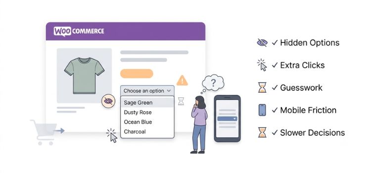
First, the options stay hidden until someone actually clicks the dropdown. If you sell eight different colors, the shopper has no idea until they take that extra step to look. That is useful information you are hiding from them for no good reason.
Second, every choice takes more effort than it should. The shopper has to open the menu, scroll through it, find the option, and then click it. Now compare that to a swatch, where the whole thing happens with one click. That may sound small, but good store design is really about removing small annoyances like this wherever you can.
Third, there is the color problem. Names like “Sage Green” or “Dusty Rose” mean different things to different people. Without a picture to look at, shoppers are left guessing. That guessing often turns into hesitation, and hesitation is what leads to abandoned carts, or even returns from people who feel like they got the wrong color.
Mobile makes this even worse. On most phones, a plain dropdown opens the phone’s own built-in picker. This usually looks nothing like your store, and it adds one more layer of friction, right on the device where most of your visitors probably are.
There is also a mental cost. When a shopper cannot compare colors by sight, they have to remember the names in their head instead. That takes extra effort at the exact moment you want them clicking “Add to Cart,” not slowing down to think.
And finally, it can quietly hurt trust. A store that only shows plain text dropdowns can feel a little less put together, even if the products themselves are great. Clear pictures make a store feel more trustworthy.
None of these problems are huge on their own. But most stores do not lose sales because of one big mistake. They lose sales because of a bunch of small annoyances that were never cleaned up.
Benefits of WooCommerce Color Swatches
Once you swap dropdowns for swatches, the benefits show up in ways that make sense once you think about how shoppers actually decide.
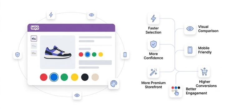
Comparing options becomes much faster. When every color is shown at once, shoppers can look at them all in a single glance instead of clicking through each one.
Shoppers also feel more confident in their choice. Seeing the real color, or something close to it, removes the doubt that often leads to hesitation. And hesitation is one of the quiet reasons people leave without buying.
Decisions happen faster too. Swatches remove a whole step, since the shopper no longer has to open the dropdown, read it, then pick something. It becomes one click instead. A shorter path like this often means more people actually finish the purchase.
Mobile shoppers benefit as well. Swatches stay part of your page’s design instead of opening whatever generic picker the phone provides. That keeps the experience smooth and matches your store’s look from start to finish.
Stores also feel more polished once they add swatches. Visual options tell shoppers that some real thought went into building the store, and people notice that, even if they cannot explain exactly why.
People also tend to click around more. Shoppers naturally explore more when they can see their choices instead of reading a plain list of text.
All of this can add up to more sales. It is worth being honest that the exact result will depend on your store, your products, and who is shopping with you. But the reasons behind it hold up well for most WooCommerce stores.
Types of WooCommerce Variation Swatches
Not every option should look the same. Here is a quick look at the common swatch types and when to use each one.
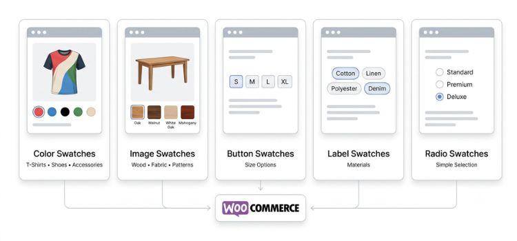
Color swatches are small solid circles or squares that show a color. These work best for clothes, accessories, furniture covers, or anything where the color is really the main thing a shopper cares about.
Image swatches show a small picture instead of a flat color. Use these when a variation has a texture or pattern that a plain color just cannot show, like wood finishes, fabric prints, or wallpaper designs.
Button swatches are small rectangle buttons with a bit of text on them. These are common for sizes like S, M, L, and XL, where the option is not really something you can show as a picture.
Label swatches work a lot like buttons, but usually give you more freedom with style. These work well for materials such as “Cotton,” “Linen,” or “Polyester Blend,” where a short word explains the option clearly enough.
Radio swatches are a simple, round selection style. Use these if buttons feel a bit too heavy for the look you want.
Most stores end up mixing these together, using color swatches for color, button swatches for size, and image swatches for anything with texture. A good plugin lets you pick a different style for each attribute instead of forcing one look on your whole store.
Where Should You Show Swatches?
Most people only think about the single product page when it comes to swatches. But stopping there leaves some real value on the table.
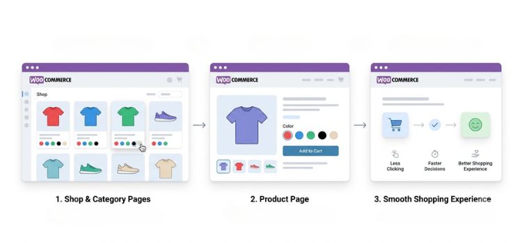
Product pages need swatches for sure, since this is where a shopper actually picks a variation before adding it to their cart. There is really no way around that one.
Shop and category pages are where a lot of stores miss out. Showing color options right in the shop grid, before someone even clicks into the product, lets them see that a T-shirt comes in five colors without loading a whole new page. That cuts down on the extra clicking back and forth between pages, something shoppers may not notice directly, but they still feel it over time.
Here’s the detailed guide on How to Display Variation Swatches on Archive or Shop Page for WooCommerce.
If your store sells several colors or styles per product, adding swatches to your category pages is one of the easiest upgrades you can make for the small amount of effort it takes.
How WooCommerce Color Swatches Can Improve Sales
The link between swatches and sales is not just marketing talk. It comes down to some pretty simple shopping psychology.
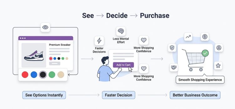
Our brains process color and shape faster than they process words. A swatch gets understood almost right away, while a dropdown option needs to be read and thought about first.
Faster decisions also mean fewer people drop off along the way. The longer someone spends deciding, the more chances there are for them to get distracted or change their mind, and swatches shorten that decision time by a lot.
There is a mental side to this too. Less effort spent remembering a color name, or opening a dropdown again just to double check, keeps a shopper focused and ready to buy instead of pulling their attention away.
Better browsing on category pages helps as well. Shoppers who already see their favorite color while scrolling tend to arrive on the product page already leaning toward buying, instead of still trying to decide.
All of this builds more trust too. A store that shows its options clearly just feels more trustworthy, and shoppers who click around and check out different variations tend to be more serious buyers overall.
None of this guarantees a set jump in sales. That will always depend on your store, your products, and your audience. But the reasoning behind it makes sense, and it is a big part of why swatches have become normal for serious WooCommerce stores.
How to Add WooCommerce Color Swatches
Here is something a lot of articles skip over. WooCommerce does not support color swatches on its own. Out of the box, product options always show up as plain dropdown menus, and there is no setting anywhere to change that.
That is exactly why plugins exist for this one feature. Building it yourself would mean writing your own code to show the options visually, matching each variation correctly using JavaScript, managing swatch colors or images from your admin area, and making sure none of it breaks the next time WooCommerce or your theme gets updated. That is a lot of ongoing work for something a good plugin already handles for you.
When you are choosing a swatch plugin, a few things are worth checking. Look for support for more than one swatch type, like color, image, button, and label, so you are not stuck with just one look. Make sure it works on shop and category pages too, not just the single product page. Check that the code is light enough that it will not slow your site down. Confirm it works well with your theme and any other WooCommerce plugins you already use. Look for a setup that does not need you to touch any code. And check that the plugin gets updated regularly, since WooCommerce itself changes fairly often.
Getting this right matters more than people expect. A poorly built plugin can slow your site down or mix up variations, and that quietly cancels out the exact benefits you were hoping to get in the first place.
Variation Swatches for WooCommerce: A Complete Solution
This is where Variation Swatches for WooCommerce comes in. It is a plugin built to fix the exact problems we just covered, instead of adding swatches as an afterthought.

At its core, it replaces plain dropdown options with color, image, button, label, and radio swatches. This gives you the freedom to pick the right style for each option, whether that is color for a clothing line or button-style labels for sizes.
Image swatches let shoppers instantly recognize the exact option they want, whether that is a wood finish, a fabric pattern, or a specific print, without opening a dropdown and guessing from a text label. That kind of instant recognition is exactly the small fix that adds up over a full shopping visit.
Shop and category page swatches bring this same clarity to the browsing stage too, letting shoppers see the colors right in the shop grid instead of clicking into every product one by one.
Variation image galleries update on their own when a shopper picks a swatch, showing them the real color or style they chose instead of leaving them to guess from a generic photo.
Out of stock styling greys out or crosses off variations that are no longer available. This stops shoppers from wasting time picking something they cannot actually buy, only to find out at checkout. It is a small detail, but it saves shoppers from a frustrating dead end.
Tooltips give shoppers a bit more information when they hover, like a color name or a material, without cluttering the page with extra text that stays on the screen all the time.
For the store owner, the plugin focuses on easy setup and simple management. You do not need to write any code or set up each variation’s look one by one. It is also mobile friendly by default, which matters a lot since most WooCommerce visitors now shop from their phones.
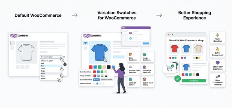
Put all of this together, and the goal is simple. Make it faster and clearer for shoppers to pick the product they want. This can help your product and shop pages look better, get shoppers to click around more, and make it easier for visitors, especially the ones coming from an ad or a search result, to actually go through with buying once they land on your site. If you run paid ads or work on SEO, this last part matters a lot, since none of that effort pays off if the product page itself gets in the way at the final step.
Will a swatch plugin alone fix a broken sales process? No, it will not. But for stores with variable products, it fixes one of the most common and easiest problems to solve on the page. Variation Swatches for WooCommerce is built to do exactly that, without needing any custom coding from you.
Best Practices for Using Color Swatches
A few tips based on working with different WooCommerce stores over the years.
Use good quality swatch images whenever you can. Blurry or low quality swatches will hurt the polished look you are trying to build.

Keep your swatch colors matching your real product photos. A swatch that does not match the actual product photo creates the same confusion that swatches are supposed to fix in the first place.
Design for mobile first. Since most WooCommerce traffic comes from phones, it is worth checking your swatch layout there before checking anywhere else.
Do not overload shoppers with too many options. Twenty color swatches packed into one row can feel just as tiring as a plain dropdown, so it is worth grouping or splitting them if your catalog is large.
Use labels that actually mean something to shoppers, instead of internal SKU codes or vague names, especially for tooltips.
Test the shopping experience often, especially after theme or WooCommerce updates, since this is one of the more common places where small bugs tend to show up.
Frequently Asked Questions
Do I need a plugin to add color swatches to WooCommerce?
Yes. WooCommerce does not include swatch features on its own. Product options always show up as plain dropdown menus, so you need a plugin to turn them into visual swatches.
Will color swatches slow down my site?
A well built plugin should not slow your site down in any real way. Look for something light and made specifically for WooCommerce, not a bulky plugin full of features you do not need.
Can I use image swatches instead of plain colors?
Yes, and they work great for patterns, textures, or finishes that a flat color cannot show clearly, like wood grain or fabric prints.
Do swatches work on shop and category pages, or only on product pages?
That depends on the plugin. Some only work on single product pages, while others, like Variation Swatches for WooCommerce, also work on shop and category pages. This brings the same benefit to the browsing stage as well.
Are WooCommerce color swatches mobile friendly?
Yes, if the plugin is built well. A good swatch plugin works the same across all devices and replaces the phone’s default picker with something that feels touch friendly and matches your store.
Can I use swatches for things other than color, like size or material?
Yes. Button and label swatches work well for size, and image swatches work well for material or pattern based options.
Will adding swatches guarantee more sales?
No plugin can promise a set result, since sales depend on a lot of different things. What swatches reliably do is cut down on friction and add clarity, which usually leads to better browsing and more completed purchases.
Do color swatches work with any WooCommerce theme?
Most well built swatch plugins are made to work with any theme. Still, it is smart to test after installing, especially if your theme has a heavily customized product page design.
Final Thoughts
Color swatches are not some magic switch that guarantees more sales. They fix a real, common problem that almost every WooCommerce store with variable products runs into. The goal was never just to install a plugin and move on. It is to actually make shopping faster, clearer, and more enjoyable for the people visiting your product pages.
If your store sells products in different colors, sizes, or materials, and you are still using plain dropdowns, this is one of the easiest upgrades you can make. It takes little effort, comes with little risk, and targets a part of your store that really matters. Variation Swatches for WooCommerce is built to handle this well, letting you match the right swatch style to your products and bring that same benefit to your shop pages too.
Improving your product pages is only one part of growing a successful online store. To learn how better user experience fits into a bigger ecommerce strategy, check out our complete guide. Then take a minute to look at your own product pages the way a new customer would. If a plain dropdown is getting in the way of a quick and confident buying decision, it’s probably time for an upgrade.d a clear, confident decision, that is worth fixing.

